- India | Oman | United Kingdom
- info@intouchgroup.in


How to Take the Right Approach to Responsive Web Design?
How to Take the Right Approach to Responsive Web Design?
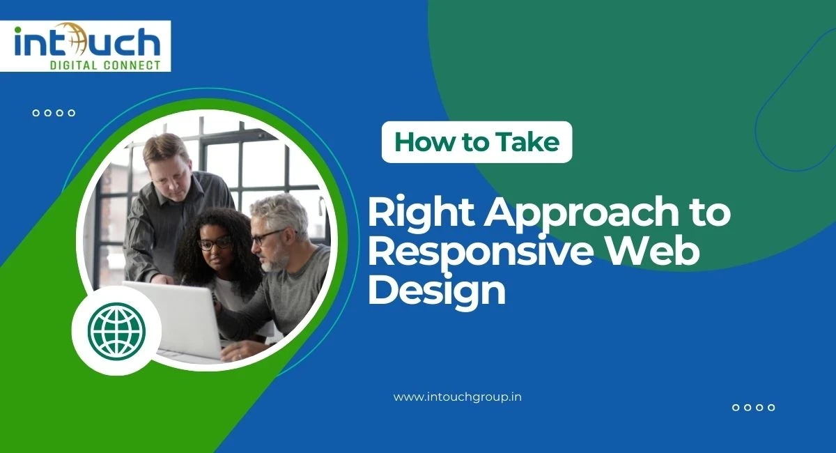
Discover the right approach to responsive web design with mobile-first strategies, flexible layouts, optimized media, and usability testing. Learn how to create websites that adapt seamlessly across devices while boosting performance, SEO, and user experience.
In today’s digital-first world, your website is often the first impression a customer has of your business. But here’s the challenge: your audience isn’t limited to one device. They might discover you on a smartphone during their morning commute, revisit your site on a tablet over lunch, and finally make a purchase on their laptop in the evening. If your website doesn’t adapt seamlessly across all these devices, you risk losing potential customers. That’s why responsive web design isn’t just a buzzword, it’s a business necessity. At Intouch Group, we’ve helped businesses across industries build mobile-friendly, performance-driven websites. Here’s how to take the right approach to responsive web design, based on our proven process. When we design, our process begins with mobile-first layouts. Why? Because mobile devices account for more than half of web traffic today. By designing for smaller screens first, we ensure that the core content, navigation, and user experience are clear and intuitive. From there, we progressively enhance features for tablets and desktops. This avoids unnecessary complexity and makes the experience smoother across devices. A rigid, pixel-perfect design won’t cut it anymore. We implement fluid grids and flexible layouts that adjust proportionally to the screen size. This ensures your website maintains its design integrity whether viewed on a 5-inch smartphone or a 27-inch desktop monitor. High-resolution images look beautiful, but if they’re not optimized, they can slow down your site dramatically. Our approach involves: Responsive images that load according to device size. Lazy loading to improve page speed. Optimized media formats for faster performance. This keeps your site visually stunning without compromising loading speed crucial for SEO and user retention. Responsive web design isn’t just about visuals, it’s about usability. We ensure: Easy-to-tap buttons and links on mobile. Clear typography with scalable font sizes. Accessible navigation for all users, including those with disabilities. This human-centered design approach keeps users engaged and reduces bounce rates. Many businesses skip this step, but at Intouch Group, we put heavy emphasis on testing across multiple devices and browsers. Simulators are useful, but nothing beats real-world testing to uncover hidden usability issues. Your website exists to deliver a message, sell a product, or drive engagement. Responsive design should never sacrifice clarity for aesthetics. We help clients structure content hierarchies so that the most important information is always front and center, no matter the device. We’re not just another agency. At Intouch Group, we provide end-to-end digital solutions from the best web design service in Delhi to digital marketing, e-commerce store management, etc., to custom software development. Our responsive design process is built around business goals, not just pixels. Whether you need a corporate website, e-commerce platform, or mobile app, we ensure it looks great and performs even better. Responsive web design isn’t optional, it’s the standard. Taking the right approach means thinking mobile-first, embracing flexibility, and focusing on usability and speed. Done right, it creates a seamless experience that builds trust and drives conversions. Responsive web design ensures that your website automatically adapts to different screen sizes and devices. It’s important because most users now browse the internet on mobile devices, and a responsive design provides a seamless experience across mobiles, tablets, and desktops. A mobile-first approach is recommended because it prioritizes essential features for smaller screens first and then scales up for larger devices. This reduces redundant code and ensures a smooth experience for users on all devices. Google favors mobile-friendly websites in search rankings. A responsive site improves page speed, reduces bounce rates, and enhances user experience, all of which are key factors in SEO performance. You can partner with Intouch Group, a leading provider of web design, web application development, and e-commerce solutions. Our responsive design process ensures your business stays ahead in today’s mobile-first digital world.Start with Mobile-First Thinking
Use Flexible Layouts and Grids
Optimize Media for Performance
Prioritize Usability and Accessibility
Test Across Real Devices, Not Just Simulators
Keep Content at the Core
Why Choose Intouch Group for Responsive Web Design?
Final Thoughts
FAQs About Responsive Web Design
What is responsive web design and why is it important?
Should I choose a mobile-first or desktop-first design approach?
How does responsive design impact SEO?
Where can I get the best web design service in Delhi?


0 Comments